The ranked features
Description
The fourth component of effector's report: the FEATURES table and its HTML counterparts, the ranked table and the bar view. What the ranking means, in which units, and what the coverage cut costs you.
Reading time
Approx. 4' to read.
What you see
In report.show(), the last table before the trees:
  FEATURES                                ranked, in the selected snapshot
  ────────────────────────────────────────────────────────────────────────
    feature        importance                          heter      #regions
    ──────────────────────────────────────────────────────────────────────
    hr                 0.7314  ██████████████████     0.2882             4
    temp               0.2281  ██████                 0.2668             1
    yr                 0.1878  █████                  0.2028             1
    hum                0.1020  ███                    0.1525             4
    ──────────────────────────────────────────────────────────────────────
    the features above carry 80% of the total importance mass
On the HTML page the same ranking appears twice in the Overview section: as the ranked table (every supported feature, one row each) and, inside a collapsible Bar view, as paired bars sharing one sorted feature axis:
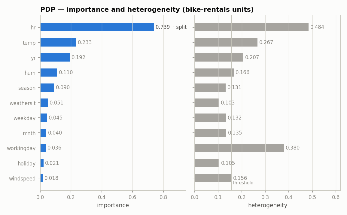
From the report embedded in the guide's map, the default
nof_instances=10_000 run; the .show() block above is the 2_000 run, so
the values differ slightly.
The three columns
Both importance and heter are std type quantities in the output's
units, so they are comparable across features and across methods.
importance: how much the feature's mean effect moves the output.heter: how much the per instance effects still spread around that mean. High heterogeneity is the signal that one curve is not enough.#regions: the leaves of the feature's accepted partition — the subregions the regional analysis actually plots; 1 means the feature stayed global.
The block bar next to importance is relative, scaled to the strongest
feature in the table.
Why does hr's heter read 0.288 and not 0.48?
Because the header says so: ranked, in the selected snapshot. hr
carries 4 regions, so its importance and heter are the instance
weighted means across those regions. 0.48 is hr before the split; the
gap between the two is what the split bought, and it is exactly the
0.48 → 0.29 entry of the
explained variance ledger.
Importance is not the whole story
Look at workingday in the bar view: importance 0.036, nearly last, yet its
heterogeneity is 0.380, second only to hr. A ranking by importance alone
would dismiss a feature whose average effect is flat but whose per instance
effects disagree violently. That two axis reading is the
triage plane, the next component; the bar view is the
same information with exact values at the bar tips, split features tagged
· split, and the search threshold drawn as a hairline on the heterogeneity
side.
What each row links to
In the HTML ranked table every plotted row is clickable and jumps to that feature's section in the regional analysis. Its last column states the feature's fate in the pipeline:
| note | meaning |
|---|---|
split into N regions |
the split was accepted by the decision sequence |
split found — rejected by the decision sequence |
a real split exists; see the rejected splits |
searched — no split passed |
the region search ran and found no split worth keeping |
below the search threshold |
heterogeneity too low; the search never ran |
Features under the coverage cut appear as dim not plotted rows: still
ranked, still measured, just not drawn.
top_k and coverage are display cuts, not search cuts
The search runs wide: every supported feature is ranked and every
heterogeneous one is offered to the selector. top_k and coverage only
decide how many features are drawn. The footer tells you what the cut
cost: the features above carry 80% of the total importance mass (the
HTML caption adds target 80%, ceiling top_k = 5).
Where to next
- The triage plane: the next component
- effector's report: back to the guide's map
importanceandheter_score: the two scalars, computed by hand